
BACKGROUND
Deane Audiology is a private audiology practice founded by Rachel Deane, with studios located in Victoria and Queensland. The practice uses the latest advanced audiological techniques in a friendly, relaxed environment to provide a highly personalised experience for every client.
PROJECT
Design and development of a new brand mark, with associated sub-branding, print and digital collateral.
SOLUTION
Typography
Deane Audiology uses a single corporate typeface, Bookmania, which has been carefully tracked and kerned to create a distinctive and recognisable logotype. Alternative characters (glyphs) have been incorporated throughout to establish a cohesive, unique, and memorable brand identity. Bookmania is used across all brand collateral for headings. Its distinctive swashes give the logotype a personal and comforting feel while maintaining a modern, refined, and highly legible appearance.
A secondary typeface, DIN 2014, provides a subtle contrast to Bookmania. Its slightly condensed design makes it ideal for body copy, particularly where line length and space efficiency are important. The combination of these two typefaces creates a balanced typographic system that is both functional and visually engaging.
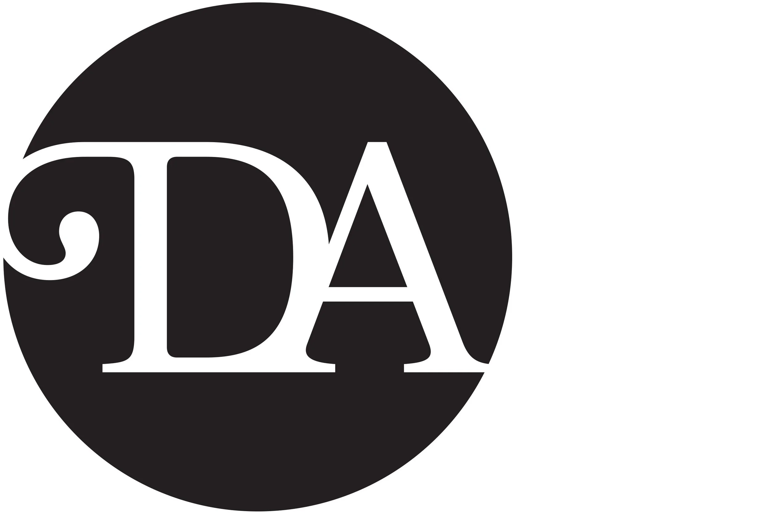
Brandmark
The Deane Audiology brand mark combines two letterforms to create a simple, distinctive, and memorable ligature. Serving as a recognisable expression of the brand, it is used consistently across social media, the website, and all corporate collateral to reinforce a cohesive visual identity.
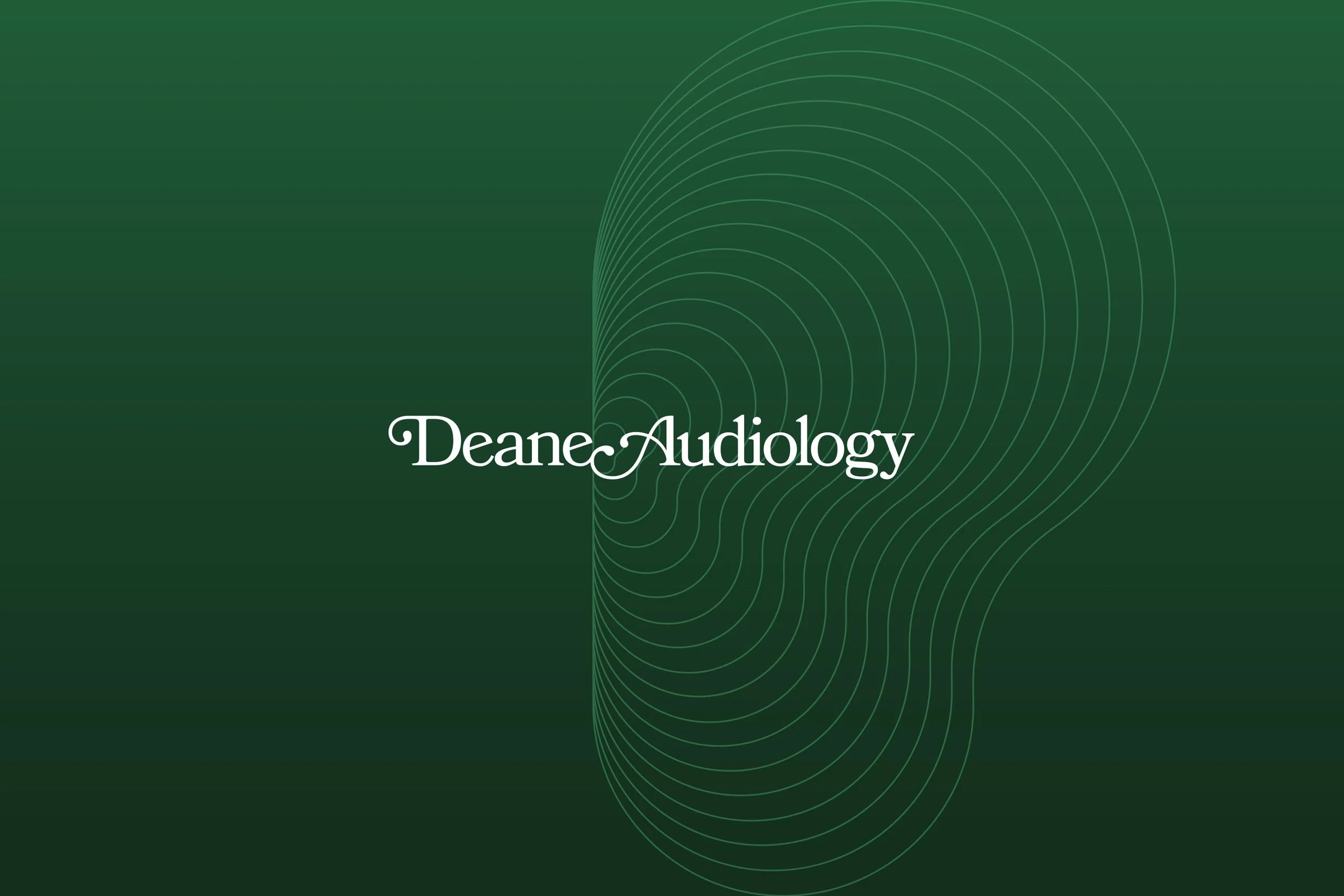
Gradation and Background Pattern
A unique gradient is used throughout Deane Audiology's brand collateral to introduce warmth, depth, and a soft, approachable feel. Paired with a custom ear-shaped sound wave graphic, this distinctive visual element reinforces the brand identity while creating a recognisable and memorable aesthetic across all touchpoints.
Studio Signage
Each studio features its own unique street signage. When backlit, the ear-shaped sound wave graphic and typography stand out against the unique green gradient, creating a welcoming and highly visible brand presence.
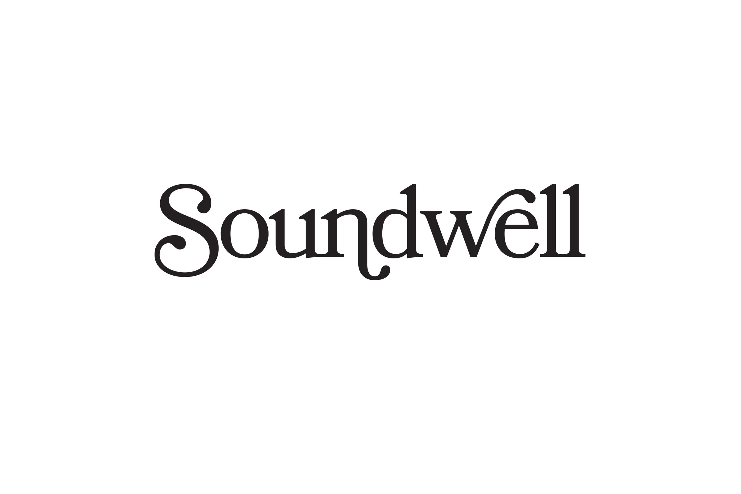
Soundwell Branding
Soundwell is an exclusive program developed by Deane Audiology that highlights the critical connection between hearing health and cognitive wellbeing. It reflects the practice's commitment to supporting long-term brain health through proactive hearing care.
Typography
As an exclusive Deane Audiology program, Soundwell adopts the same Bookmania typeface used throughout the brand identity. Glyphs, tracking, and spacing have been carefully applied to create a distinctive Soundwell logotype, ensuring visual consistency while reinforcing its connection to the Deane Audiology brand.
Pattern
A distinctive corporate pattern has been developed using layered sound waves combined with the unique green gradient. This visual element is applied consistently across Soundwell corporate collateral, reinforcing the program's identity while maintaining a strong connection to the Deane Audiology brand.
CHALLENGES
The main challenge when delivering a new brand mark for DeaneAudiology was to give the branding a personal and comforting feel while maintaining a modern, refined, and highly legible appearance, across all branding and sub-brands.