
Background
MillBuilt is based upon the core beliefs that bigger isn’t necessarily better, that one can live sustainably with style - and that affordability need never compromise quality. The result is a range of modular homes built stronger, safer and with quality finishings; designed with a due regard for sustainability.
PROJECT
We created a new brandmark, corporate iD, corporate collateral, a responsive website, a blog and a direct mail database.
Branding
The MillBuilt name was inspired by the site on which the modular buildings are constructed - an old logging mill in country Victoria. The logo symbolises the basic building modules that the architecture is based on. Bespoke 'M' and 'B' typographic characters (that are identical shapes) were illustrated, designed and combined into a unique, bold brand mark. Positive and negative forms were created so that the brand could stand out when applied to all applications. Corporate colours were chosen to reflect the principle of environmental responsibility that the MillBuilt brand holds.
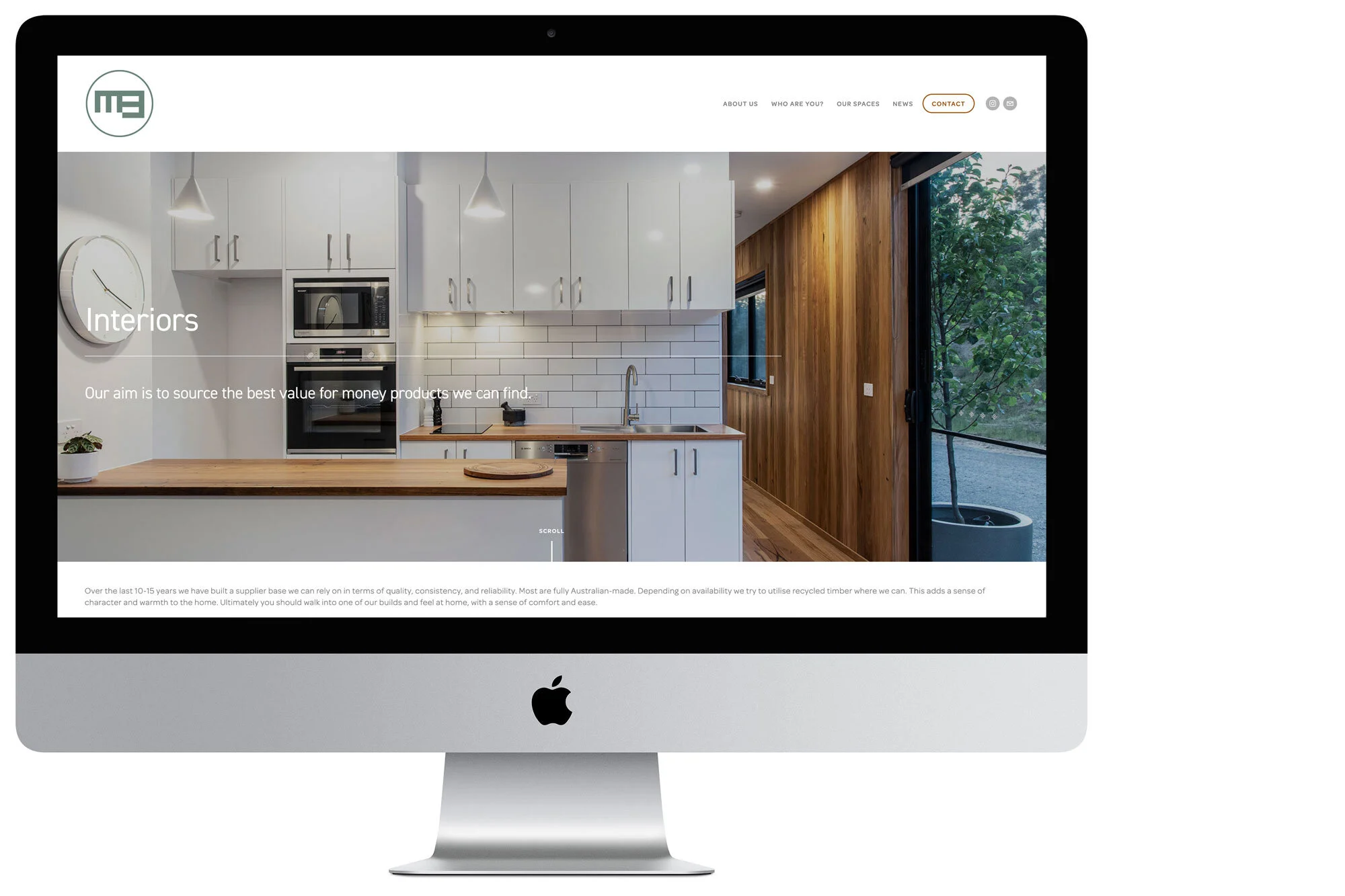
Website Design
The Website puts lifestyle front and centre, with photographic imagery of the homes being used and lived in. The navigation is simple and intuitive, with easy scrolling, quick-links and drop-down menus. Headings are big but subtle, with corporate colours used throughout to emphasise contact points. We chose DIN as the primary typeface to be used in all MillBuilt collateral. It’s an elegant, modern and very legible font with many weights, that create interest throughout all digital and print mediums. Omnes-Pro is used for body copy; being a light and legible font that tracks (spaces) well in all media.
Photography and Architectural Renders
When art directing the imagery for MillBuilt we aimed to create a sense of casual warmth, something uniquely Australian. All photography was done by Mick Sowry Photography, in the orange light of dusk, and all architectural renders were set to a lighting time of 4:30, causing a soft glow to emanate from within the rendered floor-plans.
Corporate iD
The corporate iD uses the simple typeface and two corporate colour scheme throughout all collateral; from business cards and social media, to site signage and work uniforms.
CHALLENGES
The client has many years of expertise in the building sector (although this business is a start up) and they had definite build qualities they wanted to highlight, working through a web structure was paramount to the success of the site. Photography was all new, so we could define a look and style.
RESULT
In the first two months the website has attracted 8.5K visits, 6.6K unique visitors, 56K page views and a bounce rate of only 27.6%.
“A lot of positive feedback regarding website structure and ease of use and what we are doing. I’ve probably had approx. 50 phone/web enquiries. Given 6-7 tours of Yea or Toolangi (demonstration builds) and have another 3-4 booked in. In terms of the website I’m really happy where it sits at the moment. I think we’ll give it a bit of an upgrade in 3-4 months once we have a few more builds and therefore more content.”
MillBuilt Owner.


